
Coronavirus : Update 7 from the Epicenter
G’day. Three short topics again today, starting with the usual graphs, this time shown with normal and log scales. The log scales are useful as they are exponential, which means an exponential curve should appear as a straight line. Anything curving down is slowing down :


So you can see that Italy is slowing down. The US, UK and Germany are holding steady, but the US is accumulating cases the fastest. This despite the fact that NY continues to see the overwhelming majority of incidents :

My offset chart is perhaps redundant now that all our countries are chugging along ‘nicely’, but here it it one last time with both scales :


Just to remind you, these graphs delay the plots according to the start of the epidemic in each country. They are interesting because the show the relative difference in each country’s new case rate in the latter half of the plot.
For kicks I calculated the daily case % change for each of our countries compared to the world numbers :
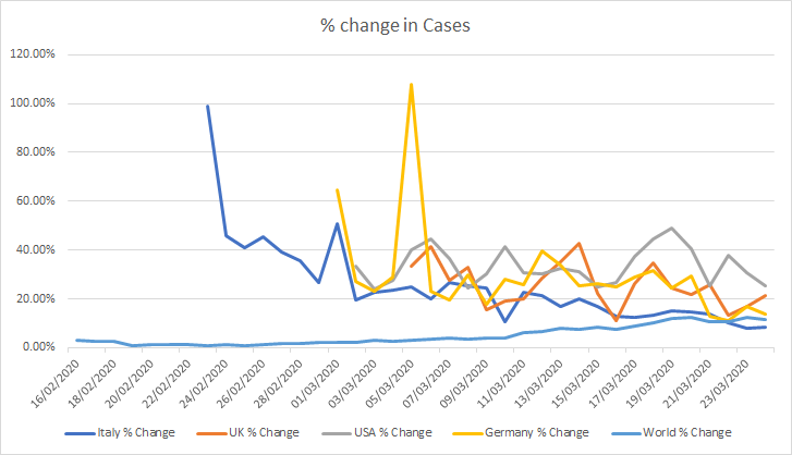
As you can see, this again shows Italy slowing down, and gives a first indication that Germany is also improving (although remember they are both still growing at >15% per day). The UK is ambiguous, and the US is clearly still accelerating. For those watching the circus that is Trump’s daily briefing, there’s no way this is over in the next 2 weeks.
I have concentrated on just our countries, but it’s worth noting that the global figures are startling. The world curve in the above graph shows a steady rise in infection rates, and the BBC brought it into focus with the following picture :

OK, second thing to note is the bizarre difference in the closed case statistics in each country :


Interpreting the graphs is complex because there are many factors at play, including testing protocols, infection rates, readiness / capacity of intensive care facilities, and population median age.
I’m not sure what the hell happened in the last 24 hours in Germany. It was either a miracle, or the data is wrong. Italy seems to have settled into a worrying equilibrium with only about half of patients surviving. I don’t have statistics on the difference in time to resolution for those that survive compared to those that die, but I’m guessing that those that die do it quicker than those that survive. There is some anecdotal evidence in the media that this is true (“my grandfather died 5 days after diagnosis” vs “my son has recovered after a month in intensive care”). Indeed, the average age of those who have lost their lives in Italy was 81. The younger ones may be spending longer in intensive care and are eventually pulling through. This means that over time we should see the deaths peter out and the recovery rate increase to something closer to the ‘final’ rate of >95% in Wuhan.
The UK seems to have an inverse curve, with mortality rates currently trending at 75%. This is worrying and appears to match the US case. I have a nasty feeling that general population health may be to blame. Many have pointed out that the Italians have one of the oldest populations as though this was a bad thing. Italy ranks 5th in the world in terms of median age (Germany 3rd, UK 50th, US 61st) which is basically a statement of age distribution. What is more interesting is life expectancy where Italy remains 5th, but Germany slips to 25th with the UK and the US is 35th. A disease that hits the weak will certainly hit the weakest first (those countries like Italy with the highest number of elderly), but it will subsequently kill the younger generations of those countries with lower life expectancy as pre-existing conditions such as obesity, diabetes and hear disease come into play. Here are some of those factors for each of our countries :
| Factor | Interpretation | Italy | UK | USA | Ger |
| Life Expectancy Rank | Lower is better | 5 | 25 | 35 | 25 |
| BMI Rank | Lower is better | 98 | 114 | 174 | 151 |
| Diabetes Rank | Lower is better | 44 | 19 | 147 | 144 |
| Heart Disease Rank | Lower is better | 13 | 18 | 25 | 24 |
| Life Expectancy | Higher is better | 83.4 | 81.2 | 78.9 | 81.2 |
| BMI (kg/m2) | Lower is better | 26 | 26.3 | 28.8 | 27.3 |
| Diabetes (% pop) | Lower is better | 5 | 3.9 | 10.8 | 10.4 |
| Heart Disease (% pop) | Lower is better | 76 | 84 | 110 | 102 |
This is certainly not a prediction of final mortality ranking – I haven’t included smoking, or blood group types (there is some evidence that type O is more resistant than A…) but globally Covid-19 is hopsitalizing 14% of 20-29 year olds diagnosed, 20% of 30 to 49 year olds, and 30% of 50 to 69 year olds, and their survival rates will depend on their general health – which may also be objectively lower in the population-dense cities where the disease is spreading fastest.
Anyway, the best way of avoiding that these factors come into play remains social distancing. China is now starting to lift restrictions, and Italy’s curve is responding to the lockdown, but the City of London’s transport system is still packed :


…and the beaches in Florida are still full of idiot teenagers on Spring Break:

Stay at home, and stay safe!
[…] low – especially compared to Italy who is still suffering with 700+ daily deaths. In Update 7 I talked a lot about demographics. New data published by just a few countries shows that while […]
[…] a fascinating look at the impact of the Spring Breakers that I briefly wrote about at the end of Update 7. Jason links to a remarkable video that shows how cellphone metadata can be used to identify the […]